A consumer environmental control redesigned around its constraints
A consumer smart-home controller, redesigned around the constraints of the device itself. PM + UX, embedded.
Role: PM and UX Designer ·Team: UX, UI, researcher (my side); product and engineering (client side) · Timeline: 3 months | Platform: Embedded touchscreen (2.4" and 4") · Domain: Smart-home environmental control · Client: European smart-home manufacturer

The Problem
The previous interface. Navigation was solely reliable on swipe gestures.The client made a wall-mounted touchscreen room controller used to manage heating, cooling, blinds, and lighting scenes. The backend and underlying technology were strong, but the interface had aged. The client wanted to bring the product back up to market standard. and the brief was specifically about the UX and UI catching up to the rest of the system.
Two issues kept surfacing in field feedback. The menu navigation was unclear - users got lost trying to return to the home screen, and the swiping pattern between pages produced inconsistent results across users. Second, page transitions stuttered and felt sticky under sensor load, because the processor had limited headroom and the existing navigation pattern was expensive to render.
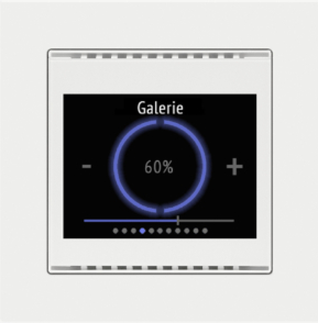
We were asked to redesign the existing 2.4" framed product and to design a new 4" standalone version using the same design language. The system also needed to scale to larger displays on the company's future roadmap.
Research and discovery
I led the user research and competitive benchmarking. Direct user interviews weren't part of the scope; instead, I worked with the feedback the client had already gathered, namely, a customer survey they'd run, plus secondhand reports from their customer-facing teams who heard from users regularly. The work involved interrogating and synthesising that material rather than generating new primary data.
The product had a specific deployment context that shaped how I thought about user needs: when a customer bought the system, a system engineer would visit the home or office and install it using an external Windows configuration app. The engineer would ask the user what they wanted, configure the device accordingly, and that was largely the end of it. Users had no meaningful way to change the setup themselves afterwards.
This came through consistently in the survey responses and the secondhand reports. People wanted some degree of control over their own device - particularly over the home screen, which was the thing they saw most often and the part where the installation model felt most rigid. The product's strength (a thoughtful installation by a trained engineer) was also creating friction (users felt locked out of their own controller). That tension informed how I thought about defaults, hierarchy, and what should be exposed on the surface versus buried in deeper configuration.
The early engineering sessions then reshaped how I thought about the problem itself. The device wasn't just a small screen. It was a small screen receiving asynchronous data from weather stations, CO2 sensors, humidity probes, temperature sensors, and the main heating unit - each with different refresh intervals and reliability characteristics. The interface couldn't pretend the data was instantaneous. It had to communicate honestly when readings were delayed, contradictory, or being recalibrated. That single realisation changed how I thought about state, feedback, and alerts across the whole product.
Key decisions and tradeoffs
Constraints as the structural brief
The hardware was bespoke and behaved unusually: limited memory, modest processing power, a 4" round display with specific voltage and backlight characteristics. The final panel hadn't even been selected when design work began. Rather than designing first and squeezing later, I made the constraints the structural prompt.
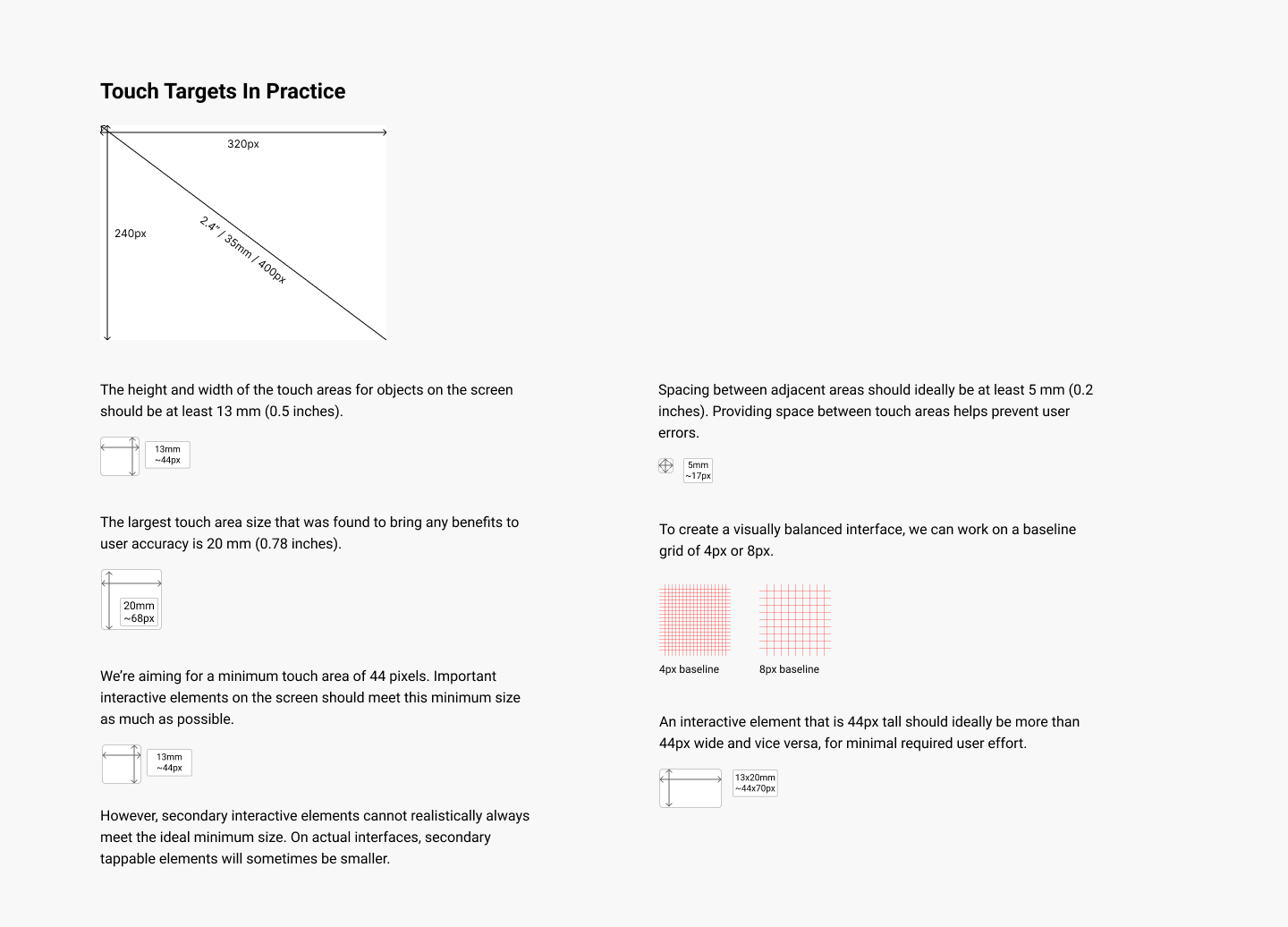
I prototyped at 320×240 pixels (smaller than the eventual 480×480) so the design would survive a late panel change. Touch targets were sized to a minimum of 13mm based on ergonomics research for standing-height kiosks, because the device was wall-mounted at 140cm - natural eye level - and would be tapped without precise motor control. Animation timing was matched to firmware update intervals so visual changes never drifted out of sync with the underlying thermal data. None of these were decorative decisions. Each one was a direct response to a measurable physical constraint, and each one came out of a conversation with the engineers.
A customisable homescreen as the user's escape valve from a rigid installation model.
Research had surfaced a real tension: the installation model produced thoughtful, professional setups, but it also left users feeling locked out of their own device. We designed an add/remove widget system for the homescreen - letting users curate what appeared in their daily view without touching the underlying installation configuration. The deeper system stayed exactly as the engineer had set it. The surface - what the user actually saw and reached for every day - became theirs.
The tradeoff was a slightly higher cognitive ceiling for users who wanted to customise, in exchange for restoring agency over the everyday experience. The widget management had to be discoverable on a small touchscreen without overwhelming the rest of the interface, and the widgets themselves had to live within the existing rendering budget. This decision was the clearest expression in the project of where design judgment sits between system constraints and user need.

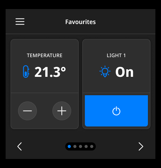
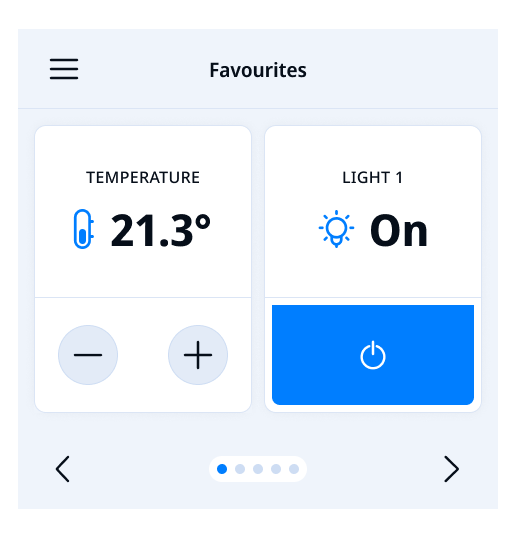
Customise dashboard: add widget slots
Customise dashboard: one widget addedNavigation redesigned around explicit wayfinding
The existing navigation was essentially a single carousel of every function and widget the device offered, with no underlying organisation. Finding anything specific meant scrolling through a long, undifferentiated sequence - and because the swipe transitions strained the limited processor, every step felt sluggish on top of the structural problem. Users got lost regularly; there was no clear way to return to a starting point or jump directly to a task.
We rebuilt the navigation around explicit wayfinding rather than relying on gestures alone. A modular overlay menu replaced the old carousel as the primary way through the product, and configurable shortcuts let users pin the actions they reached for most often. Every screen now has an obvious path home, and the menu structure maps to how the device is actually configured rather than how the old swipe model accidentally organised it. Within screens, both swipe gestures and explicit arrow buttons work side by side - deliberate redundancy rather than counting on gestures alone on a device where the interface responsiveness wasn't always guaranteed.
The tradeoff was that the product now feels less like a smartphone and more like an appliance - and some users initially expected swipe behaviour. In exchange, the product is faster (less rendering overhead on the constrained processor) and more predictable (the same action always does the same thing). On a wall-mounted device used briefly and repeatedly throughout the day, that was the right tradeoff.
Dashboard: Swipe/tap to navigate left and right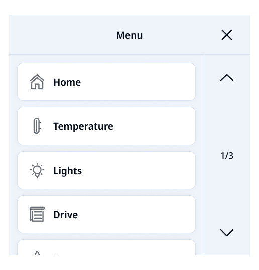
Main navigation: Menu overlayCross-functional negotiation
The clearest moment of negotiation between engineering reality and user needs was the blind controls. Engineers wanted to keep all blind functions on a single screen for technical reasons. Research showed that doing so produced visual clutter and slowed users down. We went back and forth several times with the steering committee before reaching a configuration that respected the engineering constraint while preserving usability. This kind of trade-off conversation - what the system needs versus what the user needs - was a constant thread of the project, and one of the things the PM side of my role existed to hold.
Final design
One out of a total of 10 iterationsWhat shipped
A redesigned product for both the 2.4" framed version and the new 4" standalone, in matched light and dark modes with dark mode triggered automatically at sunset
A modular navigation pattern with an overlay menu and configurable shortcuts replaced the swipe-based system, and the customisable homescreen let users add and remove widgets to shape their daily view.
A design system with organisation-wide tokens, a component library, and governance models was delivered so the client could carry the work forward into future product variants without fragmenting the experience.
Selected screens
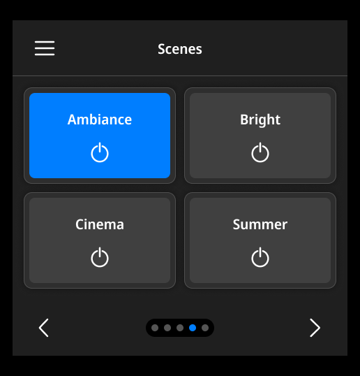
Dashboard: Scenes screen
Weekly timer details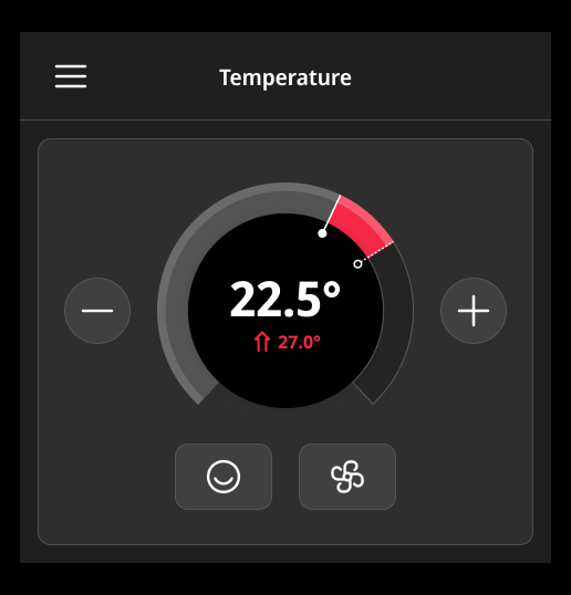
Adjust temperature screen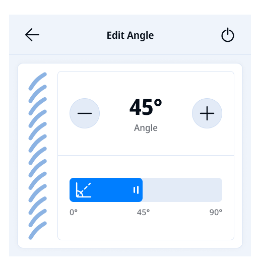
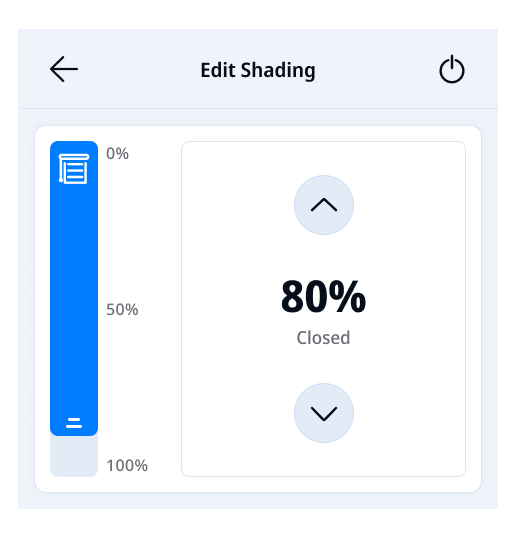
Edit blinds angleOutcomes and reflection
The product shipped across the client's distribution network and is sold in 54 countries. The modular architecture supports the client's roadmap of larger displays without requiring fresh design work for each variant. The design system gave their internal team and their dealer network a stable foundation for configuration and deployment.
“We have an important client in-house on Monday, and I feel very confident thanks to the design.”
The thing this project changed in my thinking: constraints aren't obstacles to design around - they're the structural brief. The 4" square display, the modest processor, the firmware's discrete update intervals, the wall-mounted installation height, the dealer network spread across 54 markets - every one was a constraint, and every one became a prompt for a design decision. The product is good because of those constraints, not in spite of them.
For a consumer device, this matters in a specific way: people buy the controller, install it on a wall, and then expect to forget it exists. Earning the right to be invisible - to fade into the room except when something genuinely needs attention - turns out to require the same kind of disciplined response to constraints that any complex product needs.