Modernising a legacy CFD simulation suite
Modernising a 30-year-old CFD simulation tool used in safety-critical engineering. PM + UX, desktop.
Role: PM and UX Designer ·Team: UX, UI, researcher (my side); product and engineering (client side) · Timeline: 1 year of work + implementation partnership | Platform: Windows desktop Domain: Industrial safety and risk simulation· Client: UK-based Scientific simulation software company
The Problem
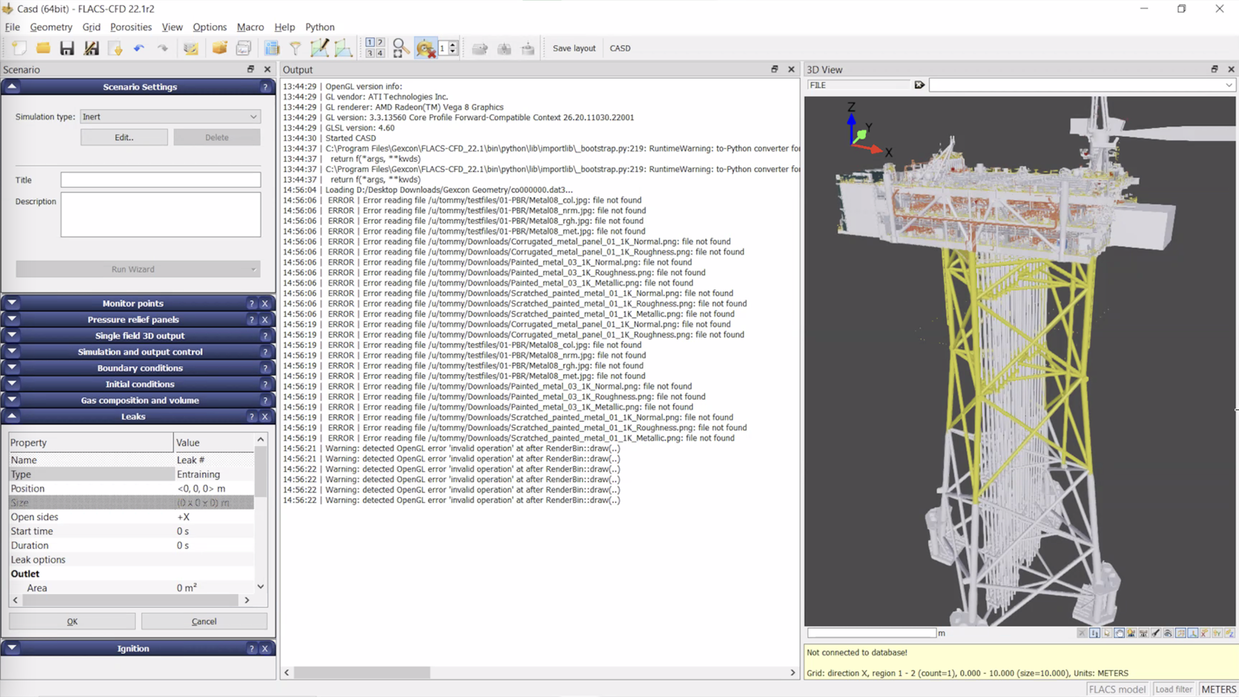
The previous interface, in use for over a decadeThe product was a decades-old simulation tool used by engineers and risk consultants to model gas dispersion and explosion scenarios in industrial environments. Decisions made with it had real safety and financial consequences.
It was also legacy software. Three separate applications had been bolted on over the years to handle the three stages of work - case preparation, simulation, and data analysis - each with its own interface conventions. Only highly trained engineers could use the system independently, and even then, only after long onboarding that included specialised training and workarounds for the rougher parts of the experience.
The client needed two things at once: keep the existing experts happy (the people who relied on the tool's depth and accuracy), and lower the entry bar enough that new engineers and adjacent roles could become productive without weeks of dedicated training.
Research and discovery
24 user interviews
12 competitor benchmark
9 stakeholder interviews
2 yearly user conference presentations
I ran most of the user interviews, across both internal users (the client's own engineers and risk consultants doing compliance analyses) and external users (engineers at companies the client sold to, ranging from professionals to occasional users). The two groups had different relationships to the software, and surfacing that difference was where the project's direction came from.
I also immersed myself in the software directly. I did the client's training, ran their exercises, watched the tutorials, and modelled scenarios myself. The goal was to be able to talk to engineers in their own language - about the physics, the workflows, the parts they found frustrating - before I asked them to trust me with redesigning the tool they used every day.
Across the project, I was the common thread between stakeholders: end users, the client's product manager, their developers, our UI designer, and the rest of our research team. The PM side of my role was about negotiating between these groups - finding middle ground between developer constraints and user needs, and keeping the design coherent as competing requirements came in.
In parallel, I documented every task in the system (over a hundred of them) tagged by frequency, difficulty, and underlying user goal. That task map became the basis for every design decision that followed.
Key decisions and tradeoffs
For each critical UI challenge, I led multiple rounds of design exploration, committing to several concrete directions before converging on the strongest one. Interactive prototypes and usability testing at each stage shaped the next round. Linear exploration would have hidden tradeoffs that only became visible once we forced ourselves to commit to multiple directions and let the constraints surface against each other. Three of the decisions that came out of that work:
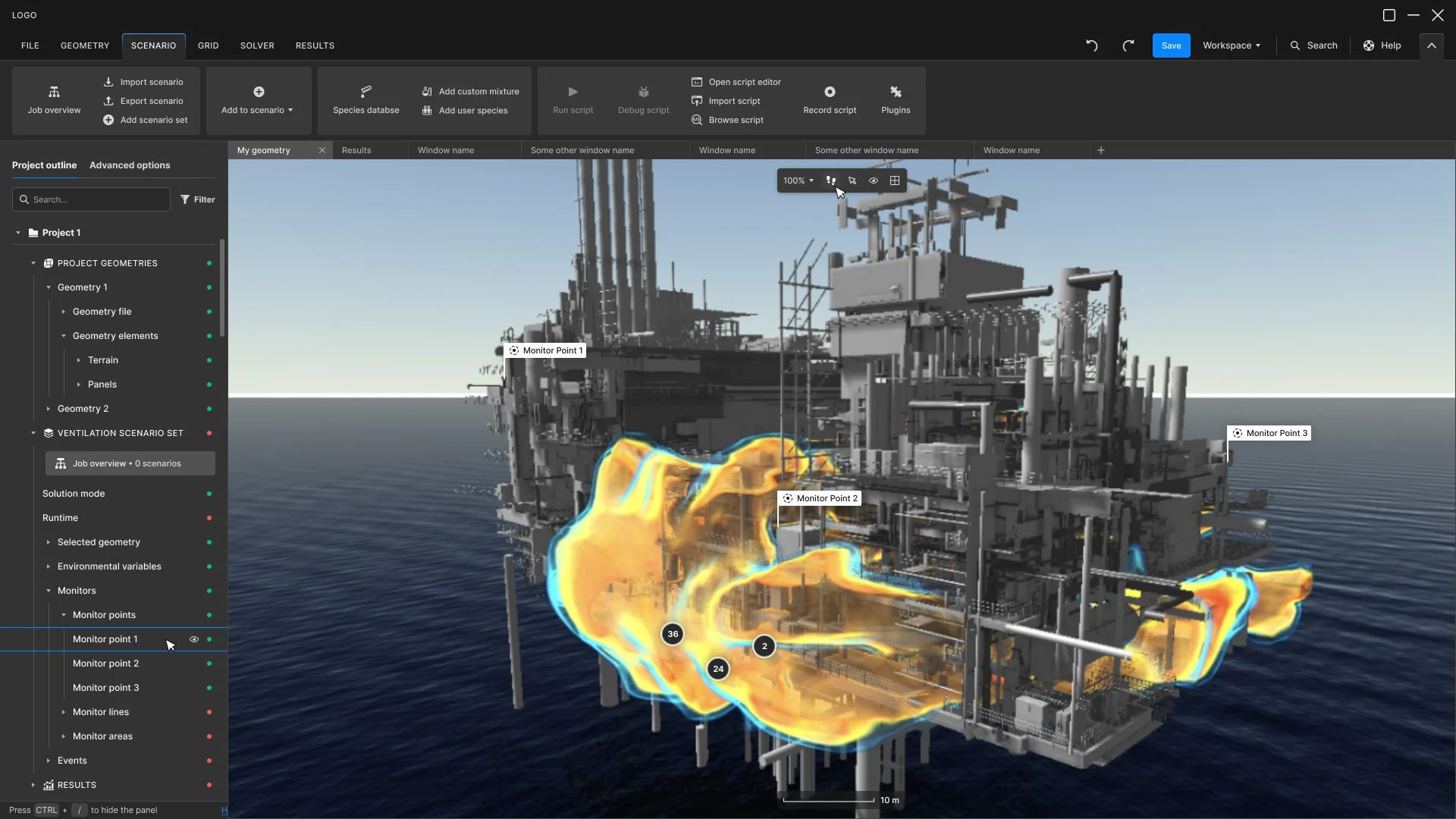
Unifying three applications into one experience
The product split case preparation, simulation, and data analysis into three separate applications, each with its own interface logic. I argued for unifying them. It meant real work; carefully optimising navigation, deciding how much guidance to bake in versus how much flexibility to preserve, and making sure power users wouldn't lose access to anything they relied on. But the existing fragmentation was forcing users to context-switch three times per project, and the cost of unification was small compared to the cost of leaving it as-is. It also gave the engineering team a single product to maintain going forward.
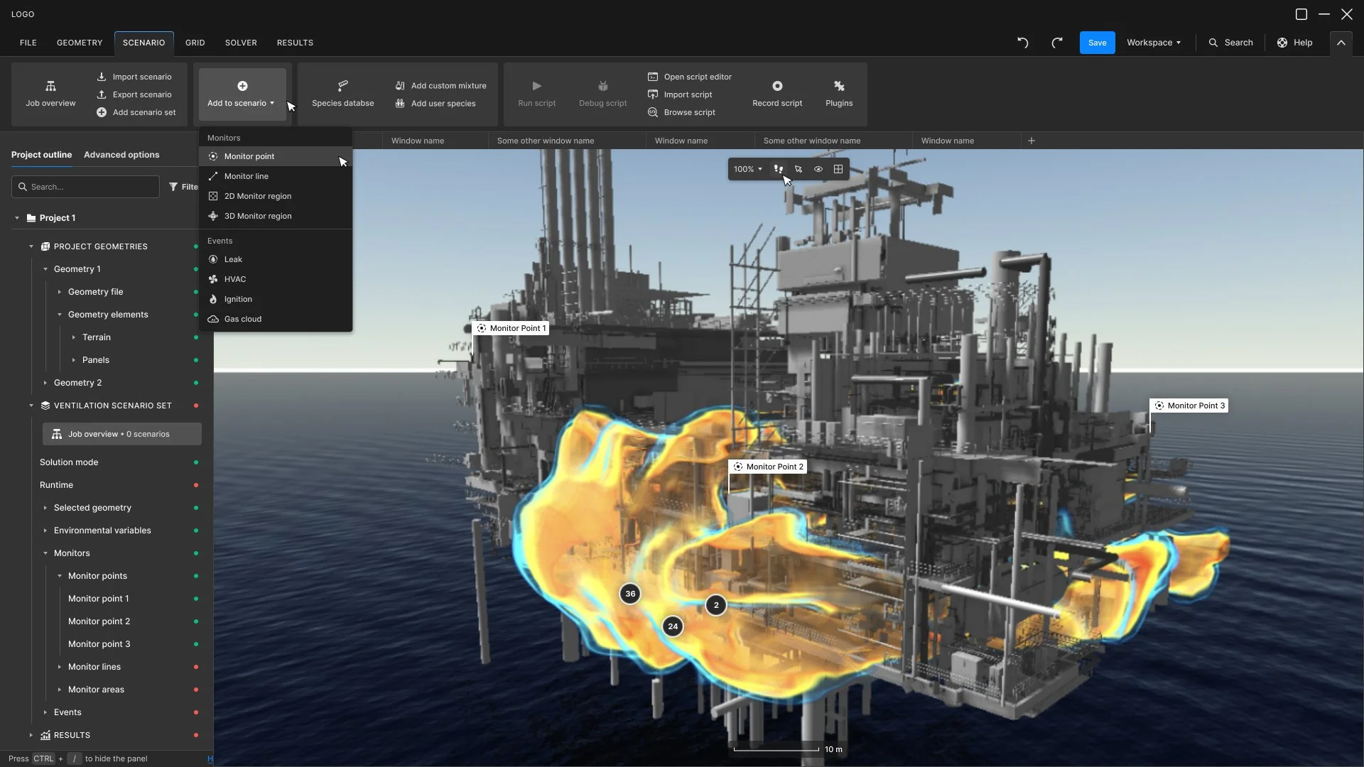
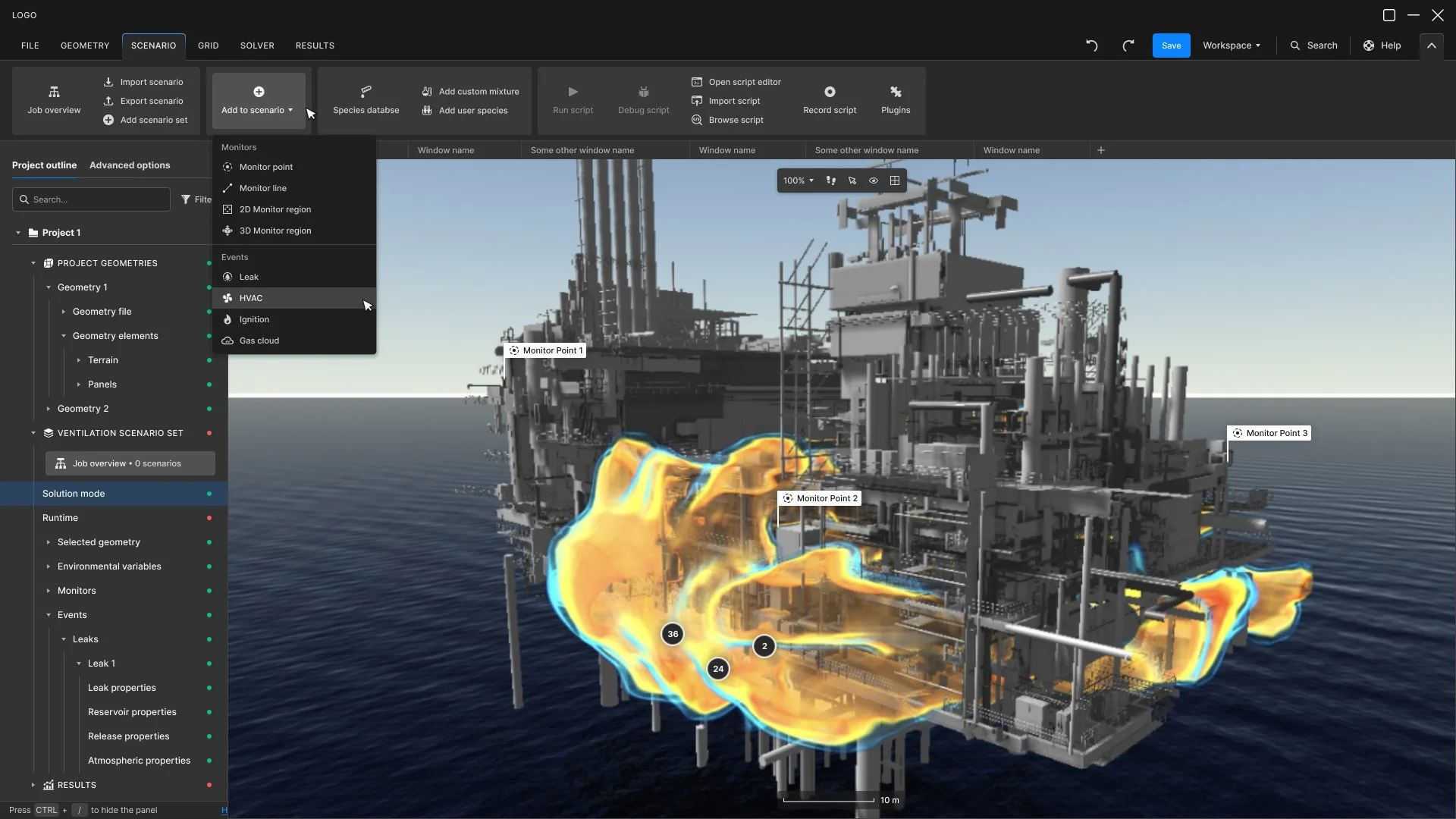
Scenario menu optionsA single layered interface, not two modes.
The obvious move would have been to ship a "simple mode" for newcomers and an "expert mode" for power users. Research showed that wasn't the right pattern. Beginners and experts did the same things - they just moved at different speeds and held different expectations about what should be visible by default. A dual-mode interface would have fragmented the product and forced users to migrate as they grew, slowing their learning curve. We chose a single layered interface where complexity is progressively revealed rather than hidden behind modes. The design was significantly harder; the product became simpler.

Advanced options available both in each object definition window, and in the project layers navigationDesigning specialised data visualisations for engineering decision-making.
The wind plot, the gas dispersion cones, the radial temperature gauges - these aren't decorative, they're instruments engineers use to make safety decisions. Designing them required a controlled visual grammar (discrete bands for magnitude, consistent angular resolution, semantic colour) that supported scientific accuracy rather than just looking good. The tradeoff: less visual freedom than a typical dashboard design, more rigour required.
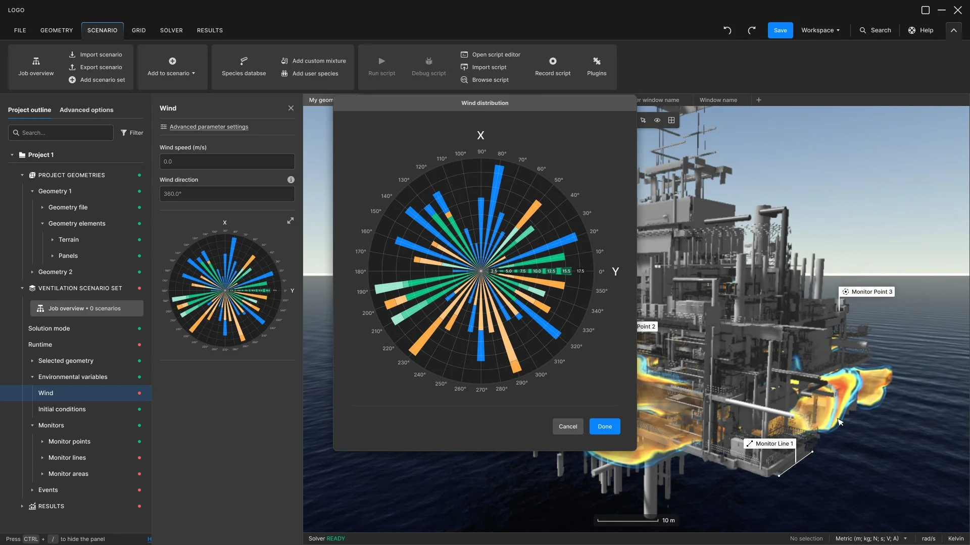
Wind rose plottingInformation hierarchy reorganised around the simulation workflow.
The existing interface used a cascading Windows-style dropdown menu; multiple levels of nested menus users had to traverse to find anything. The pattern had been standard when the product was first built but had aged out of relevance, and the depth of nesting was actively working against the engineers who used it daily.
I replaced it with an Office suite-style ribbon organisation. Fewer hierarchy levels, with main categories ordered to mirror the logical sequence of the simulation process — case preparation, model setup, simulation, results analysis. Users now move through the product following the work itself rather than navigating an abstract menu tree.
This was one of the most iterated parts of the project. The tradeoff was real: long-time users had built deep muscle memory around the dropdown system, and even though the new structure tested as faster to navigate, the initial migration was uncomfortable for experts who had to relearn where things lived. We worked through multiple rounds of testing and refinement, and mapped every old menu item to its new ribbon location so the change was traceable, not arbitrary.
Reorganised and optimised main navigationWhat shipped
Once we'd converged on the interaction architecture and reasoning, I worked closely with our UI designer to translate the design into a finished interface.
I onboarded her into the project deliberately - helping her get to grips with the domain without overwhelming her - and stayed with the UI work through every step.
My team delivered hundreds of high-fidelity UI screens covering every workflow in the product, in matched light and dark modes. We also delievered a complete design system (tokens, components, documentation) and the interactive prototypes and iterations behind the design decisions. The design system was documented thoroughly enough that the client's engineering team could carry it forward without us in the room.
Selected screens
Define geometry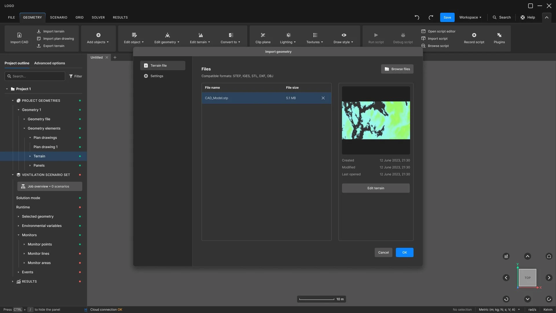
Import geometry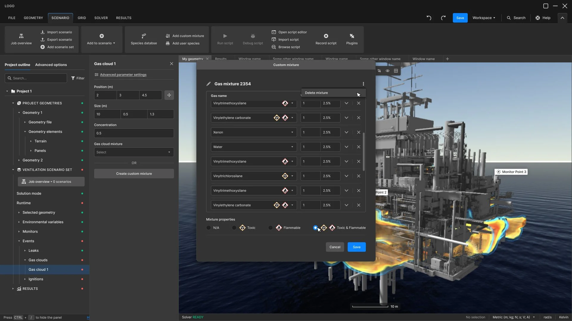
Create custom gas mixture
Define HVACOutcomes and reflection
Time to first successful simulation: 4 days → 6h
Corrective load/simulation: 4-6h → 20 mins
Configuration errors/simulation: 5-8 → 1-2
Training: multi-day events replaced by short videos and webminars
What this project taught me, and what I've taken into every project since, is this: in expert software, the design work doesn't actually start until you can hold both the novice's frustration and the expert's intuition in your head at the same time. Both are legitimate truths about the product. Privileging either one — making it too simple for experts, or too dense for newcomers — produces worse design than holding the tension.